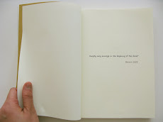
The image is simple and simply good to tell the meaning of "Classic".
The tagline" 8 GB of classic comedies" make the whole print ad spirit complete.
Advertising Agency: Publicis, Gurgaon
Creative Director: Emmanuel Upputru
Art Director / Illustrator: Sunny Johnny
Copywriter: Anindya Banerjee
Digital Retoucher: Nishan Singh
April 18, 2009
April 16, 2009
Recommend: D&AD blog
D&AD is an educational charity that represents the global creative, design and advertising communities.In the above blog, you can see the up-to-date design article from world-wide designers and advertising planners. Also you can go to the following websites for design references. D&AD Sites:
www.dandad.org Talentpool Student Awards Winners 2008
YouTube channel Flickr stream D&AD Annual 2008 Twitter
Magazine ads: Xian-Janssen
Analysis of the advertisment
Execution style: As...as
Solution: Using a stapler in the middle facing pages of magazine to simulate the irritation , which is in order to show the pain sometimes caused by the little irritation.
Advertising Agency: DMG Beijing, ChinaCreative Directors: WeiBing Xu, Donghao, Kelvin LaiArt Directors: HeJia Shen, Kelvin LaiCopywriter: DonghaoPhotographer: Tiger Han
April 14, 2009
Print ads for Trim- health drink
The contrast in the print ads is used so proper. The action is natural ,and the visual is affective and clearly tell the selling point through the interesting way. But in the view of the client, these print ads are not so success to increase brand recall for healthy drink, since the visual impression overweights the drink of TRIM.
Advertising agency: Leo Burnett Jeddah, KSA
Art director: ZorZi Hoyek
Photographers: Roger Moukarzel, Steve Kozman
Illustrators / Retouchers: Mark Calina, Julien Lions
Account Group Director: Georges Maktabi
Published: March 2008
April 13, 2009
Comparison- WWF earth hour
Advertising Agency: Ogilvy Group Ukraine
Creative Director: Will Rust
Art Directors: Taras Dzendrovskii, Dmitri Shishkin
Photographer: Goran Tacevski
I think the first one you all have read before, which is the HongKong verison for 328 earth hour. And the second one is from another country. To compare with these two print ads, we can see the difference and characteristic of Hong Kong Culture.
-Bigger logo from authority
-Clear slogan with text description
-Numbers of Sponsorships
-Bilingual
-More rational convincing
Which one do you like?
April 12, 2009
Thematic Advertisment- Korea
I think this advertisment more likes a video show than a TVC. Through this example, we can see Thematic ads emphasize the atmosphere, tone and total image delivery. In fact, we cannot actually read what is the core selling message in the ad. The Korea video is elegant and huge-scale production. nice~
Subscribe to:
Posts (Atom)