March 21, 2009
Branding with Pattern
We are also use her Post-its and taps in daily life.
But... Have you aware of her representative pattern:
Sometimes when we design the corporate identity of A brand, other than colors,typefaces and graphics, pattern is also the choices. The checkered pattern with yellow lines and slanting interbars is the beautiful symbol of 3M's Scotch.
LEGO association
Yeah. This is a waffle.
Can you see the square butter ? To associate the brown honey as the chocolate jam that the waffle is look like HK "朱古力味格仔餅"; this is so friendly with us!
I love this lego design very much, therefore upload to here for showing off.^^
The wonderful development of Legos amazes us by the figuring power that people can make ,although they are just in rectangular and square shapes.
The above design is one of my favorite I've seen .
Designed by Jonathan Hunter:
March 20, 2009
Flickr Clock
I think the different color and height bars composed an interesting and beautiful interface for the web of Flickr clock. Also the idea of using clock to present the continuously updating images is quite fresh. See the website from the below link
March 19, 2009
2008 HK4As Kam Fan Awards
The Kam Fan Awards (formerly known as the HK4As Creative Awards), is organized by the HK4As every year since 1984 to recognize the best works in the market. It is considered one of the largest & prestigious awards shows in Asia.
We have joined the student awards in the begining in semester 1 ,which is the rare experience for us and good for learning advertising.Although we didnt get any praise from this year, I think we still have the opportunity in the coming years in SD. To watch the ceremony of 2008 Kam Fan Awards by the above link, see who are the winners in this year. These would be the useful information for our interview.Hope u like it*
7 days Tissue - Promotion Mix
One is Marketing Mix: 4Ps , and other one is Promotional Mix: A P P S .
A P P S are short for Advertising , Personal Selling , Public Relation and Sale Promotion.
When we think of Promote 7 Days tissue, there are 4 aspects for us to concern.
The first presentation we made only focus on the "advertising Part"- Print ads campaign ,Package design and Corporate Identity. Maybe in the final preseantation, we can apply A P P S to organize our promotion campaign.
Promotion is our focus in 4Ps channels, which can be carried out in various ways:
- advertising (developing brand awareness);
- publicity (sponsoring a sports team);
- public relations (donating to charity);
- celebrity appearances;
- door to door sales;
- price discounting (see section 1, “Price”);
- quantity discounting (two for one offers, bundling).
7 days Tissue -Product Life cycle Model
The idea of the Product Life Cycle was first developed in 1965 by Theodore Levitt in an article entitled “Exploit the Product Life Cycle” published in the Harvard Business Review on 1 November 1965.
For 7 Days Tissue, if we plan to add the new selling point: High quality / technology development, that 7 days tissue is regarded as the "Introduction stage" .
The 4Ps considerations of 7 Days Tissue in the introduction stage include:
1.Product development: research and development of the basic technology and product concept, determining the product features and quality level.
2.Pricing: should penetration pricing or a skimming price strategy be used? A skimming price strategy might be appropriate where there are very few competitors.
3.Distribution: distribution might be quite selective until consumer acceptance of the product can be achieved.
4.Promotion: marketing efforts are aimed at early adopters, and seek to build product awareness and to educate potential consumers about the product.
Sources from:http://www.tomspencer.com.au/2009/01/25/product-life-cycle-model/
March 18, 2009
Sunday Report: " Kong girl"
This is the hot and interesting topic within HK young people ,which reflects the culture of Hong Kong Males and Females. I think emergence of the term- " Kong girl" is because of the shifting of postion in commercial society and the changing personal value in HK females's mind. It is an issue worth us to deep thought.
One of the best hoilday
by MRI Starch (Advertising age)
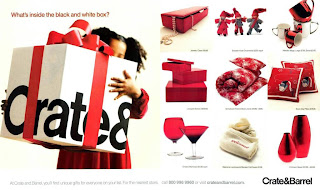
The Crate & Barrel Stores ad serves as a helpful gift-giving guide for readers, spelling out all that they would need to know explicitly and with great visual appeal.Apart from the gift display, the ad also includes a photo image of a little girl, partially obscuredfrom view by the large Crate & Barrel gift box that she holds. In keeping with the rest of the ad,her dress is red, as is the ribbon that is crisply tied around the box. MRI Starch data repeatedly underscore the fact that bright primary colors are an invaluable tool for capturing reader attentionat high levels. As such, red (particularly when juxtaposed against a snow white background) was the ideal choice to maximize both the ad’s visibility and its own “very merry” brand of holidaycheer.
Agency: Dangel Advertising, Lake Forest, ILCRATE & BARREL STORES
Publication: O The Oprah Magazine, 12/2008
Category: Home & Building-Direct Response
Engagement Score: 121%
Category Average: 71%
March 17, 2009
IMC with PLC in 0317 tutorial lesson
IMC- integrated marketing communication
PLC - Product life cycle
Marketing Mix: 4Ps
http://www.provenmodels.com/13/four-principles-of-the-marketing-mix/mccarthy
1. product: select the tangible and intangible benefits of the product
2. price: determine an appropriate product pricing structure
3. promotion: create awareness of the product among the target audience
4. place: make the product available to the customer
Promotional Mix: A P P S
Today we have the rich lesson in marketing knowledge, and learned how to application the rules in our project.
March 16, 2009
SexY Style Print ads- Lentheric
This series of print ads come from the brand-Lentheric, which is the same high-end and sexy brand in my last post. In the adverts, the directors try to use contrast and denotation to promote their products with sexy ladies. In fact, the sexy babies are really attractive but i think the metaphor is not used quite smart to associate with the tagline: UP your game which i like.
Executive Creative Director: Stephen Burke
Art Director: Riaan van Wyk
Copywriter: Jed Dawson
SexY and high-end Paris Style
The website of Lentheric: http://www.lentheric.com/
You can feel the stylish and paris taste through the TVC and her website.
For some expensive goods, we always target the audience as upper-class income group.But it is difficult for us, the students to understand the luxury lifestyle. Therefore we should learn the styling from other high fashion brands or related and successful advertising.
March 15, 2009
Creative Cover design
This cover design can be customized by the buyer freely. I like this variety of owning my unique book cover. That idea can apply in designing personal notebook, sketch book and journal ... Also it implies designing the label or stick objects in production of personal notebook is good. It is because that offers the free matching and personal design for the users to build their style of these kind of personal books.
Design make playing become learning
LEGO SERIOUS PLAY is an innovative, experiential process designed to enhance innovation and business performance. Based on research that shows that this kind of hands-on, minds-on learning produces a deeper, more meaningful understanding of the world and its possibilities, LEGO SERIOUS PLAY deepens the reflection process and supports an effective dialogue - for everyone in the organization.
These series of LEGO toys have 4 main purposes:
1.Strategy development and exploration
Examine and evaluate relations to external partners and clients.
2.Organizational development
For management, teams and individual employees.
3.Innovation and product development
Unleash creative thinking and transform ideas into concrete concepts.
4.Change management
Facilitate and implement structural changes and mergers.
I love the creative and competitive idea of this set of construction toys from LEGO, but I think the name is not good to show the relax and playful association. In the view of the officers, they may want to learn from more interesting and challenging playing.
CMYK net dots
Famous Speech from Leo Burnett
This speech was delivered by Leo Burnett at a meeting of the entire Chicago Burnett office on December 1, 1967. 'When to take my name off the door' is the best speech in the whole life of Leo Burnett. Moreover, this is one of the touched speech ,recommended by ECD Connie Lo. If you hope to work in Leo Burnett Advertising agency, you have to watch this video for reference.
To read the draft of speech , you can search from Google where offers the relevant sources.