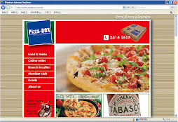
April 16, 2009

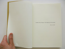
Magazine ads: Xian-Janssen


Analysis of the advertisment
Execution style: As...as
Solution: Using a stapler in the middle facing pages of magazine to simulate the irritation , which is in order to show the pain sometimes caused by the little irritation.


Advertising Agency: DMG Beijing, ChinaCreative Directors: WeiBing Xu, Donghao, Kelvin LaiArt Directors: HeJia Shen, Kelvin LaiCopywriter: DonghaoPhotographer: Tiger Han

April 14, 2009

Print ads for Trim- health drink


The contrast in the print ads is used so proper. The action is natural ,and the visual is affective and clearly tell the selling point through the interesting way. But in the view of the client, these print ads are not so success to increase brand recall for healthy drink, since the visual impression overweights the drink of TRIM.


Advertising agency: Leo Burnett Jeddah, KSA
Art director: ZorZi Hoyek
Photographers: Roger Moukarzel, Steve Kozman
Illustrators / Retouchers: Mark Calina, Julien Lions
Account Group Director: Georges Maktabi
Published: March 2008

April 13, 2009

Comparison- WWF earth hour

Advertising Agency: Ogilvy Group Ukraine
Creative Director: Will Rust
Art Directors: Taras Dzendrovskii, Dmitri Shishkin
Photographer: Goran Tacevski

I think the first one you all have read before, which is the HongKong verison for 328 earth hour. And the second one is from another country. To compare with these two print ads, we can see the difference and characteristic of Hong Kong Culture.
-Bigger logo from authority
-Clear slogan with text description

-Numbers of Sponsorships
-Bilingual

-More rational convincing

Which one do you like?

April 12, 2009

Thematic Advertisment- Korea

I think this advertisment more likes a video show than a TVC. Through this example, we can see Thematic ads emphasize the atmosphere, tone and total image delivery. In fact, we cannot actually read what is the core selling message in the ad. The Korea video is elegant and huge-scale production. nice~

April 11, 2009

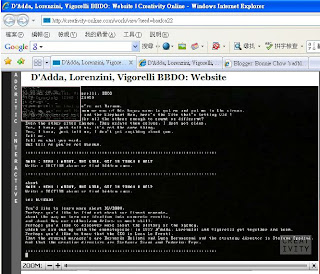
Vigorelli BBDO: Website


http://www.dlvbbdo.com/
An Italian agency harks back to computer days of yore.

D'Adda, Lorenzini, Vigorelli BBDO have launched new agency website that operates like MS-DOS and requires type commands to move around the site. The loader video is static and the sound of a dial-up modem.


Check
the above web link to experience the interesting effect from this webdesign. The idea can be simplified as back to the tradition version; when something is development so fast,people will be happy to see it back to the oldest state because the original always still has many points worth for concern.

Organize advertisement campaigns

Sources from:
1. Semantic analysis (keywords selection)
carry out the semantic analysis of current advertisement campaign text and pick up list of keywords that are necessary to carry out advertisement campaigns. (Keyword , I guess is selling point )

2. Context (or search) advertisement
Search engines are the most attendant Internet-resources. The majority of Internet users (approximately 80%) exactly there looking for required information. Baltic Design Colors will place the context or search advertisement on the pages of search engines to reply the request of the user (e.g. advertising campaigns "Google-AdWords").
Thus the majority of people who are affected by advertisement are concerned auditory. Besides, we can carry out the advertisement only in regions which interest the advertiser.

3. Branding
Banner advertising belongs to branding, which directed to increase the popularity of brand, promote new products and services.Baltic Design Colors company creates and places your branding on thematic advertisement areas, news resources, in catalogues and search engines.

4. Developing and carrying out the complex advertisement campaign
According to tasks of advertisement campaign it could include banner and context advertisement, mailing and non-standard forms of communication. provides the best return, since the greatest part of the Internet segment is covered.

April 10, 2009

Toshiba HD -Ambient Ad

Toshiba again- BUS STOP (My favorite ambient ad)
Advertising Agency: Shalmor Avnon Amichay/Y&R Tel Aviv, Israel
This is the corporate advertisment showing the brand attitude and building the image to connect to the target audiences.In this ambient ad , you can not see any concrete selling point for Toshiba's product, but you can get the impression that Toshiba want to deliver. Also the idea is decent and good in final outcome.

Toshiba 16GB SD print ads


I like this one the most. The elegant shape of the ship looks like a container of lady facial cream. Water blue is soft, also ship shows the meaning of dream and leave. The graphic magnifies the function of the storage of SD card , and link to the brand slogan- Leading Innovation.


Sometimes a set of print ads is beautiful in same meaning, but not pretty for all pieces of graphics . Therefore how to organize a unit of print ad is not the easy thing.

Display in the E-commerial

This E-com website used effective and clear display for her luxury wallet and bag.
You can movie the mouse to see the zoom in verison of each part of the product in the right bigger frame. I post it is because i appreciate the technic to show the product as real as possible in the broswer. We can consider this function to apply in Advertising since E-com is so common now .

http://www.eluxury.com/estore/browse/product_detail.jsp?id=11929501

Maxim's Angle cake Slogan

The last month, I have heard a new Chinese slogan for Maxim's cake.
Maxims Cake shop- angle cake
"夠鬆軟, 我心軟"

I think those six chinese words are used so proper. It looks like simple, but it is nice in expression and sound.The words-"心軟" make the slogan become alive. That links eating to the touching feeling of human being, which is similar as like.

April 8, 2009

wonderful ending of 7days project 0704

7 days - Share my belief

My favorite art work in this project,
especially thanks for onda's Logo design.


I have learned so many principles and theories of advertising promotion through this project. And the most joyful thing is the experience in working condition- cooperation with different teams people(visualizing, digital media, creative team, client) in producing an ad campaign and try to take the roles of Art Director and Marketing planner. (thanks for teammates's trust)

Best wishes

Packaging design for Juice

From the creative & cutie outlook of this product with "賞味期限" , where do you think it is made from?

haha* love japanese packaging design
This Japanese packaging is functional and well-designed. Without knowing the product, you can simply observe that it is a banana juice beverage. I anticipate, and hope, that this company will extend this theme to other fruits like oranges, apples, and strawberries where the packaging would have to be differentiated on color and texture.

Creative Media- fresh out of the oven


BakerTweet from POKE on Vimeo. (http://bakertweet.com/)

Poke built a twitter system that allows bakers to twitter what's coming fresh out of their ovens--and communicate with their customers in real time.

How does it work?
In simple terms it's a bakery-proof box that sends messages wirelessly to Twitter. The clever bit is that the baker can update their messages and things they're selling using a simple web interface. Obviously not something that you'd do mid-bake but it's an important feature for future-proofing the device.